
 EN

How Colour Tissue Creates Eye-Catching Inner Packing for Gift Boxes
When a customer lifts the lid of a gift box, the inner wrap is often the first material they see and touch. That makes colour tissue more than a filler: it can frame the product, soften the reveal, and make a simple box feel deliberately prepared. From a gift-wrap and retail merchandising perspective, the useful question is not simply which shade looks attractive. It is whether the paper, fold, and packing routine create the intended presentation without making the pack-out awkward.
At first this may look like a colour decision; more accurately, it is a colour-and-workflow decision. The right colour tissue should support the item inside, the box interior, and the way a team wraps repeat orders. This guide walks through those decisions in the order they occur at the packing table.
Start with the moment the box is opened
Think about the visual sequence. A recipient sees the lid, the first layer of tissue, then the product. A bright contrast can make the reveal energetic; a closely related tone can make it feel calm and coordinated. Neither is automatically better. If the product itself has a strong colour or printed surface, a quieter colour tissue may leave it as the focal point. If the product is neutral, a deeper or more vivid tissue layer may provide the visual lift.
For gift boxes, judge the tissue against the actual interior rather than against a screen swatch alone. Interior board colour, lighting, ribbon, stickers, and the product all change how a shade reads. A folded sample inside the intended box is a more useful checkpoint than a colour name on its own.
Choose a colour relationship, not just a favourite shade
A practical selection begins with one of three relationships:
- Tonally coordinated: tissue sits close to the brand or box colour for a restrained, considered finish.
- Deliberately contrasted: tissue makes a neutral box or product stand out, provided the contrast still fits the brand palette.
- Seasonally adjusted: tissue changes for campaigns or gifting periods while the outer box remains consistent.
That is the appearance side. The next question is how the material reaches the packing table. A shade that looks suitable in a flat sheet can look different after it is crumpled, layered, or tucked around a product. Ask the team to review the sample in the same condition customers will receive it.
Use colour tissue as an inner-packing layer
Inner packing works well when every layer has a clear job. In many gift boxes, colour tissue can be used in three ways: as a base liner, as a wrap around the product, or as a top layer that hides the contents until opening. The combination depends on the product’s shape and how much visual softness the package needs.
Base liner
Lay a sheet of colour tissue into the empty box before adding the item. This creates a visible background and can reduce the hard visual boundary between the product and the box. Leave enough paper at the sides to fold inward neatly; an overly small sheet may look accidental, while excessive paper can make the box appear crowded.
Product wrap
Wrap the item with enough slack for a gentle fold rather than pulling the paper tight. For presentation-led items, controlled folds usually look more intentional than heavily compressed tissue. If the item needs protection beyond surface separation, confirm the required protective material separately. Tissue can improve appearance, but it should not be described as a substitute for protection the product genuinely needs.
Top reveal layer
A final sheet can create the opening moment. Use it when the first visual impression matters, but test whether staff can close the box consistently without catching or tearing the tissue. This may be a reasonable starting point, although final fit should be confirmed with the actual box depth and closure style.
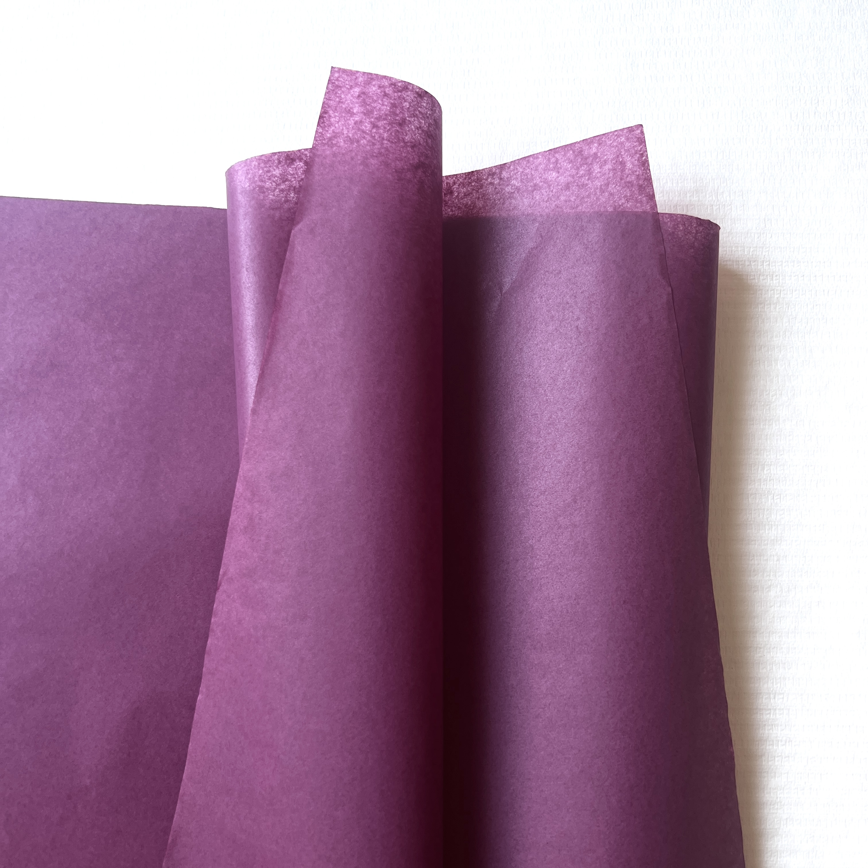 Layered tissue helps define the opening reveal in a gift box.
Check handling before finalising the look
Retail presentation and packing speed need to work together. Will the team handle this material as continuous rolls, pre-cut sheets, or both? For a low-volume curated pack-out, a more elaborate fold may be manageable. For repeat fulfilment, the preferred arrangement is often one that staff can reproduce with a small number of movements.
Consider these sample-review questions:
- Does the selected colour tissue sit neatly inside the finished box without forcing the lid upward?
- Does the tissue show the product at the intended point in the opening sequence?
- Can the packer repeat the fold with consistent results?
- Does the tissue colour remain appropriate beside labels, ribbons, and inserts?
- What still needs confirmation about sheet size, paper feel, quantity, or custom requirements?
After a sample review, record both what was assessed and what remains open. That simple note prevents a good-looking one-off sample from becoming an unclear instruction for a larger run.
Where colored tissue paper fits in a broader brand system
Colored tissue paper can be a flexible part of a brand system because it gives gift boxes a changeable interior layer without requiring a new outer box for every campaign. It is especially useful when a business wants to differentiate collections, seasonal gifts, or product tiers through colour while keeping the pack-out recognisable.
Still, visual consistency should be treated as a design decision to validate, not a promise made from a description. Review a folded sample beside the real product and any printed packaging components. If a custom request is being prepared, separate must-have details from preferences: intended use, box dimensions, preferred format, approximate quantity context, and the approval method. A custom request becomes manageable when those variables are clearly separated and prioritised.
Make colour tissue part of the packing specification
To make colour tissue repeatable rather than improvised, add it to the pack-out specification. Name the intended box size, whether the paper lines the base or wraps the product, the preferred fold direction, and what should remain visible when the lid opens. This gives a new packer a usable instruction instead of an aesthetic guess. It also makes sample feedback more precise: the team can say whether the colour tissue is too small for the corner folds, too dominant beside the product, or difficult to position consistently.
For campaign work, keep a small reference set with the approved colour tissue, the box, ribbon, and insert together. Photographs can help document the arrangement, but the physical set is still valuable because it shows paper texture, translucency, and folded volume. If different products share one box format, test each product with the same colour tissue layout before assuming the result will translate.
Use a practical handoff checklist
- Confirm the chosen colour tissue shade against the real box interior and product.
- Confirm the sheet dimensions and the number of sheets used per box.
- Show the intended tissue placement in the pack-out instruction.
- Identify which features are essential to the visual reveal and which are optional.
- Approve the final arrangement from a physical sample, not an unverified digital colour match.
Colored tissue paper is most useful when its visual role is clear to everyone who handles the order. A well-documented arrangement lets the gift box look intentional across repeat orders while leaving room to adjust a campaign colour when the brand plan changes.
Build a simple approval routine
Before rolling a new inner-packing style into regular use, prepare one completed gift box and review it from the recipient’s viewpoint and the packer’s viewpoint. Check the opening impression, the amount of visible paper, closure, and repeatability. Then confirm the final specification with the supplier based on the approved sample rather than relying on an assumed match.
In short, colour tissue creates eye-catching inner packing when its visual role and handling role are designed together. Use it to frame the product, coordinate or contrast the box interior, and stage the opening reveal. Then validate the sheet size, fold, colour relationship, and pack-out routine with a real sample. That approach keeps the presentation purposeful while giving the packing team a process they can repeat.