
 EN

How Black Tissue Paper Packaging Shapes a High-End Mysterious Brand Vibe
Black tissue paper packaging is often treated as a finishing detail, yet it can be one of the first branded surfaces a customer touches after opening a box. Used with intention, it creates a pause between the outer carton and the product, helping an unboxing sequence feel quieter, more deliberate, and more exclusive. The effect does not come from black alone. It comes from how color, texture, folds, contrast, and handling work together at the packing table.
From a packaging-paper technical advisor’s perspective, black tissue paper packaging should begin with the use case, not a generic luxury claim. A dark sheet may support a mysterious mood around jewelry, cosmetics, accessories, or special-edition goods. Still, the relevant question is how it behaves in the actual pack-out: how it frames the item, how easily it folds, and whether the reveal remains clean from first order to repeat order.
Why black changes the first visual impression
Color sets an expectation before a recipient reads a label or sees the product. In packaging research and design discussion, black is commonly associated with sophistication, exclusivity, and premium positioning. That association is useful context, not a guarantee of higher perceived value. The product, the graphics, and the rest of the presentation still need to support the same message.
Black tissue paper packaging works especially well when it creates contrast. A pale product box, metallic logo, satin ribbon, or light-colored insert can appear more intentional against a deep background. The eye lands on the brighter element, then moves through the box in a controlled sequence. At first this may look like a color decision; more accurately, it is a color-and-reveal decision.
For a mysterious brand mood, restraint matters. A black interior can make a small mark, foil accent, or product silhouette feel more focused. Too many competing colors can weaken that effect. Before ordering black tissue paper, place a folded sample beside the actual box, label, ribbon, and product color rather than judging the shade in isolation.
Build the mood through the unboxing sequence
The most convincing black tissue paper packaging usually has a clear job in the sequence. It may line the box, loosely wrap an item, separate components, or conceal the product until the final fold is opened. Each role changes the visual result. A liner provides a dark stage around the product. A wrap creates a slower reveal. A separator can make multiple pieces feel organized without making unsupported protection claims.
Consider the fold and reveal from the recipient’s viewpoint. A symmetrical fold with a centered seal can feel composed and ceremonial. A softer, less rigid fold can feel intimate and handcrafted. Neither is universally better. If the brand needs a precise, graphic presentation, test a consistent folding method. If warmth and texture are more important, allow a little natural variation while keeping the tissue clean and well positioned.
That is the appearance side. The next question is how the material reaches the packing table. Black tissue paper packaging should be tested with the real box dimensions and order routine. A sheet that looks generous when flat may require repeated trimming; another may be too small to create the intended fold. A short pack-out trial reveals whether the paper tears, bunches, or slows the sequence before a full run is placed.
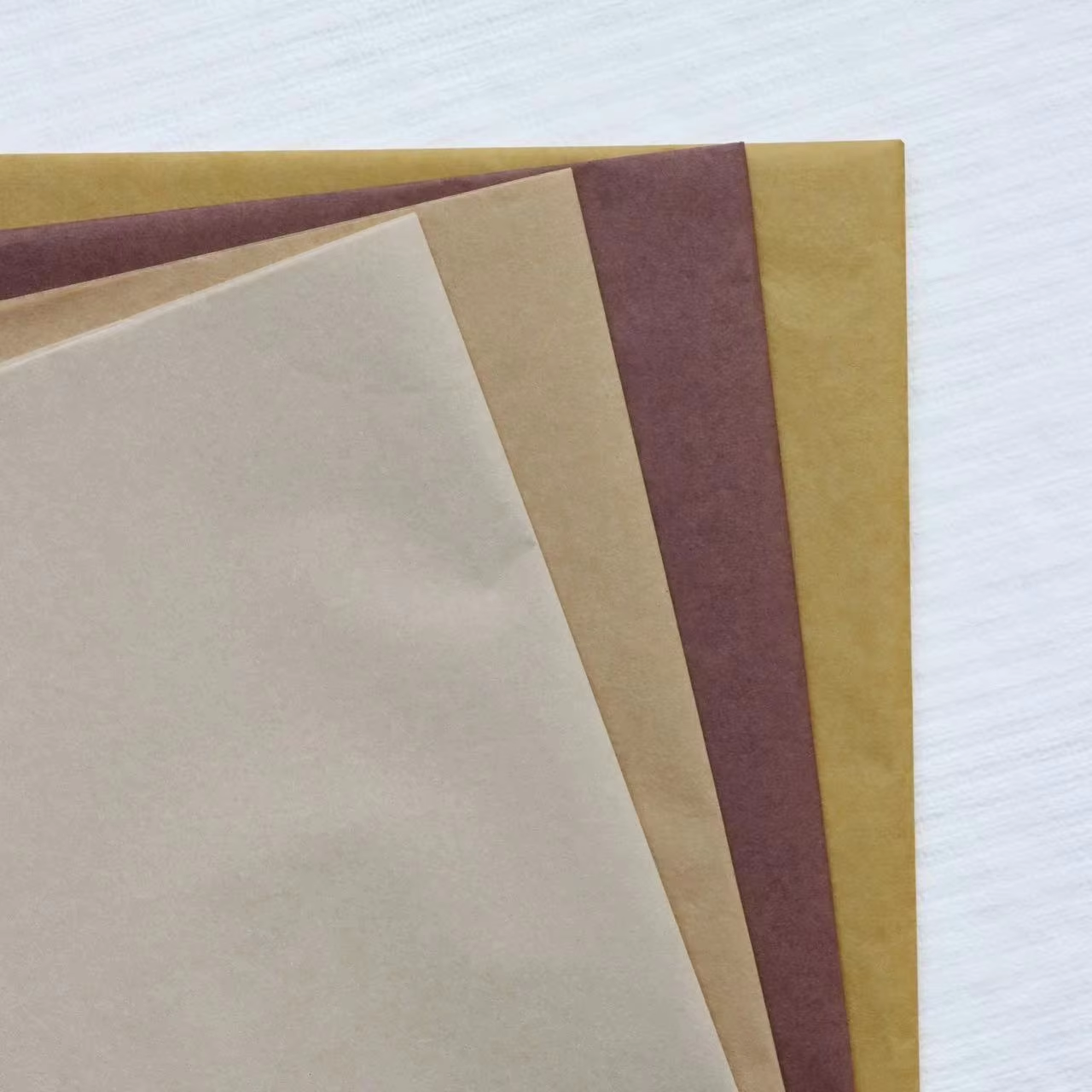 Black tissue can frame a product reveal while a pale box and insert provide visual contrast.
Choose black tissue paper by use conditions
Black tissue paper is not a substitute for protective packaging. If the item is fragile, heavy, sharp-edged, or sensitive to movement, first define the appropriate protective layers and then decide where black tissue paper packaging belongs in the presentation. The tissue can contribute to visual separation and a refined reveal, while the protective solution should be selected for the actual transit risk.
For presentation-focused use, review these practical questions:
- Box relationship: Does the tissue create enough contrast with the carton and product without making details hard to see?
- Sheet or roll workflow: Are pre-cut sheets more consistent for the team, or does a roll better match varied order sizes?
- Fold behavior: Can staff make the intended reveal without excessive creasing, tearing, or trimming?
- Surface coordination: Does the tissue complement the chosen sticker, ribbon, insert, or printed mark?
- Sample review: Has the complete pack-out been checked under the lighting and handling conditions that matter for the brand?
These questions prevent a common mistake: approving a beautiful black tissue paper sample without reviewing the finished workflow. The question changes from “what is the price?” to “what format reduces unnecessary handling while preserving the intended reveal?” That distinction matters when a team packs many orders or when several item sizes share one presentation system.
Make mystery feel intentional, not heavy
Black can feel cinematic, but black tissue paper packaging can also become visually heavy if every adjacent element is dark. Use a point of relief: a cream insert, a restrained metallic mark, a colored product label, or simply negative space around the item. The goal is not to make the box look dim. It is to create a deliberate contrast that lets the product become the focal point.
Texture also affects the result. Smooth tissue can support a clean, controlled look, while visible folds add softness and movement. The appropriate choice depends on the intended recipient experience and the packer’s workflow. If presentation is the priority, a brief sample review with the actual item is more useful than relying on a color swatch alone.
When discussing black tissue paper packaging with a supplier or internal team, specify the application first: lining, wrapping, separating, or display presentation. Then document the box size, product dimensions, desired fold, order volume, and any visual elements that must remain visible. This gives the conversation a practical basis without assuming that one paper format suits every project.
A practical approval routine before rollout
- Set the desired mood in plain language: quiet luxury, modern drama, restrained mystery, or another defined direction.
- Prepare a complete sample with the actual box, product, insert, closure, and black tissue paper.
- Ask packers to repeat the sequence several times and note trimming, alignment, and handling issues.
- Review the first impression and the final reveal under relevant lighting.
- Adjust sheet size, fold method, or contrast elements before standardizing the process.
This routine turns black tissue paper packaging from a decorative afterthought into a controllable part of brand presentation. It also keeps expectations realistic: tissue can frame a product and support a premium, mysterious atmosphere, but the overall experience depends on the full packaging system.
Final takeaway
Black tissue paper packaging can give a high-end brand a more mysterious and composed unboxing moment when it is matched to the product, box, and packing workflow. Start with the intended use, test the real reveal, and treat black tissue paper as a visual layer rather than a universal protection solution. With that approach, the finished package can feel considered from the first fold to the final discovery.