
 EN

How single color wrapping paper keeps your packaging clean and minimal
Minimal packaging is not about removing every detail. It is about deciding which detail should lead. Single color wrapping paper gives that decision a clear starting point: one controlled field of color around the product, with fewer visual signals competing for attention. For a small retail team, event planner, or brand manager, that restraint can make a hand-packed order feel considered rather than overworked.
As a packaging designer, I look first at hierarchy. Before choosing a bow, sticker, or insert, ask what the recipient should notice in the first two seconds. With single color wrapping paper, the answer can be the color itself, a small label, the texture of the paper, or the shape of the parcel. The wrap acts as a quiet backdrop, so the other element has room to do its job.
Why one color creates a cleaner packaging system
A busy pattern can be charming, but it introduces another message: season, theme, mood, or illustration. A single-color surface has a different role. It establishes a consistent visual base across boxes, bottles, apparel, cards, and irregularly shaped gifts. When packages vary in size, repeating one hue helps them read as one collection rather than a set of unrelated objects.
This is useful when your brand already relies on a small palette. Use single color wrapping paper in the dominant shade, then reserve a second color for a logo label or a narrow ribbon. The contrast directs the eye without turning every parcel into a separate design project. A solid color paper wrap also makes type easier to read, particularly when a simple black, white, or metallic mark is the only printed element.
The visual effect comes from consistency, not from a claim that one approach fits every product. If the item has a colorful identity or the occasion calls for illustration, a pattern may still be the better choice. The point is to let the wrap support the intended message rather than compete with it.
Choose the color before choosing the decoration
Start with the emotion and the viewing conditions. A warm neutral can feel calm and tactile; a deep shade can create contrast around pale labels; a soft pastel can keep celebratory packaging light. Then test the color beside the actual box, tissue, seal, and shipping label. The color on a swatch may look different once it surrounds a package and sits under indoor lighting.
- For brand consistency: choose a shade that sits close to your established palette, then use the same wrap across multiple order types.
- For an elevated gift: pair a dark or muted wrap with one crisp label and a restrained ribbon.
- For seasonal flexibility: keep the wrap stable and change only the small accessory, such as a tag or seal.
- For high-volume packing: choose a shade that remains legible with your label stock and does not make handwritten notes hard to read.
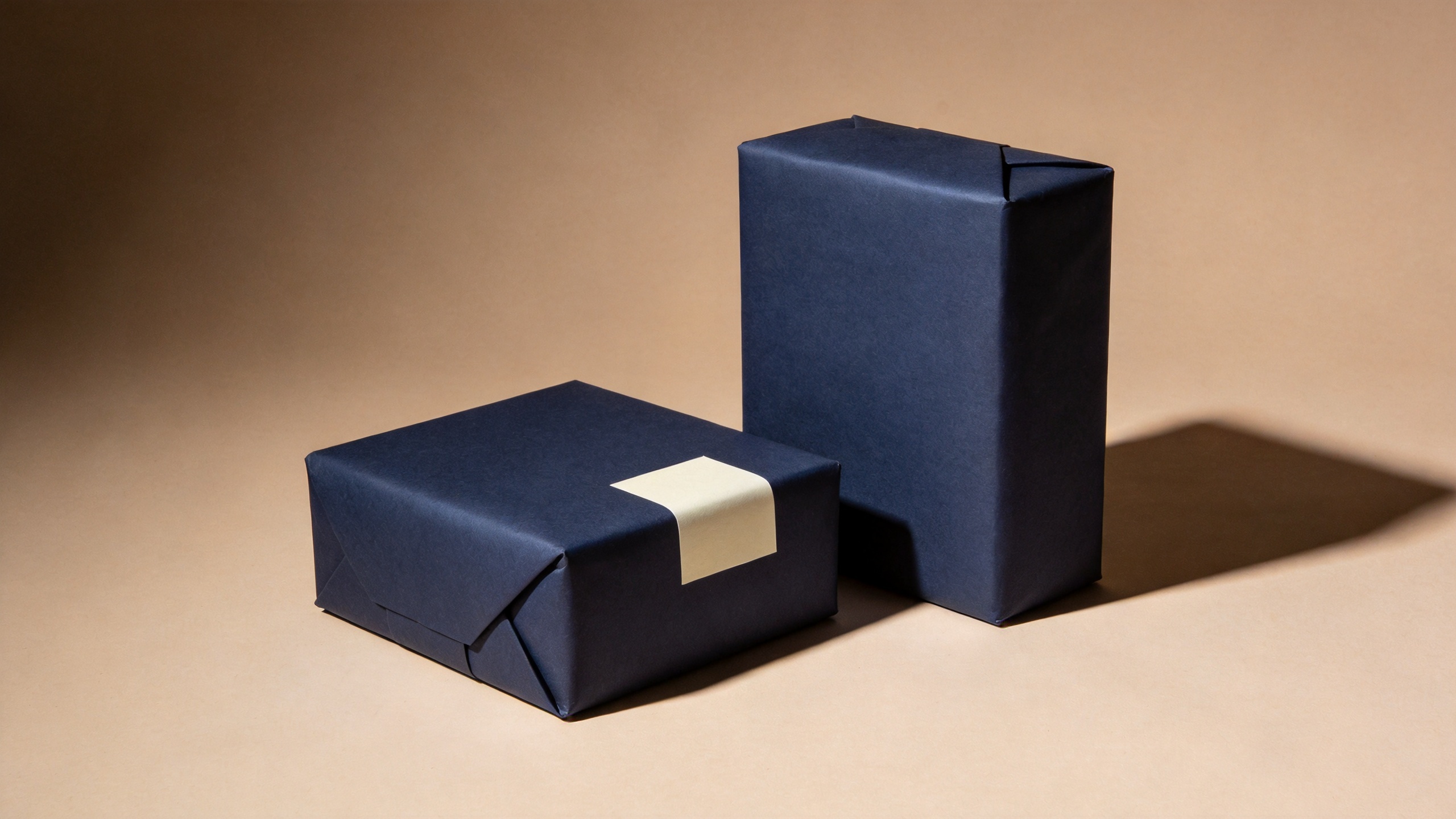
The goal is not to match every component exactly. Slight variation between paper, tissue, and ribbon can add depth. The system stays minimal when the differences are intentional and limited.
Finish is part of the message
Color sets the first impression; finish changes how that color behaves. Matte single color wrapping paper tends to soften reflections and works well when you want the label, texture, or folded edge to be noticeable. A glossy surface catches light and can give a brighter, more celebratory look. Textured, coated, and uncoated options each change how tape, ink, and stickers perform, so test a small sample before committing to a full run.
Use finish to reinforce the product rather than invent a story around it. For example, a tactile item may pair naturally with an uncoated or lightly textured wrap, while a polished presentation can suit a smoother finish. Use fewer accessories than the paper itself: one narrow ribbon, a matching-color seal, or a compact card is usually enough.
Build contrast with only one supporting element
The easiest way to lose a minimal look is to add several small “finishing touches” at once. Instead, choose one point of contrast. It can be a white label on a dark wrap, a dark seal on a pale wrap, or a ribbon in a closely related shade. That single interruption gives the eye a destination.
Think of the package as a small composition. The wrap occupies the largest area, the label carries information, and the accent creates emphasis. When all three have different colors, patterns, and finishes, the result may feel crowded. When the wrap is a solid color paper, you can be more deliberate about the remaining two parts.
| Element | Minimal choice | What it helps control |
|---|---|---|
| Wrap | One consistent color | The overall visual field |
| Label | One high-contrast shape or wordmark | Information hierarchy |
| Ribbon or seal | One same-color or contrasting accent | Focus at the closure point |
| Insert | Simple type and generous margins | The unboxing message |
Plan for different package sizes without losing cohesion
A one-color approach is especially helpful when parcels are not uniform. The paper creates continuity even when one order is a small jewelry box and another is a tall apparel carton. To keep folds clean, select a roll width that gives your team enough coverage without producing excessive overlap. One retailer’s product listing, for example, estimates that a 24-inch by 85-foot roll can wrap roughly 40 to 50 gifts; treat figures like that only as planning references because box dimensions, overlap, and wrapping style change real usage.
Set a practical folding rule for the team. Align the seam on the underside, keep tape off visible corners, and place the label in the same relative position on each package. Repetition in these small decisions often matters more than extra decoration. Single color wrapping paper makes that repeatable routine easier to see and maintain.
A quick check before you pack
- Does the wrap color support the product and brand palette?
- Can the label be read at a glance against the paper?
- Have you chosen one accent instead of several?
- Does the finish work with your tape, seal, and packing conditions?
- Would the package still look intentional if several sizes were displayed together?
If the answer is yes, the packaging is likely doing what minimal design should do: making the product, message, and moment easier to notice. Single color wrapping paper is a simple material choice, yet it can provide the visual discipline that helps a package feel calm, well-organized, and ready to represent your brand.