 EN

Why Pastel Color Tissue Paper Creates Soft, Trendy Gift Aesthetics
Pastel color tissue paper does more than fill a gift bag. Used thoughtfully, it gives a package a quieter first impression: light, considered, and easy to coordinate. For gift-wrap and retail presentation, the most useful question is not simply “Which pastel shade is popular?” It is how the tissue will work with the product, box, ribbon, and packing routine.
From a gift-wrap and retail merchandiser’s perspective, pastel color tissue paper should be judged by the unboxing impression as well as the way it fits the packing station. Search results for this material commonly point to gift wrapping, craft use, color assortments, and sheet formats. The opportunity for a brand is to turn that broad interest into a deliberate presentation system rather than a random mix of pale colors.
Why pastel shades feel soft without making a package look unfinished
Pastels are usually perceived as lower-intensity versions of familiar colors. In a gift package, that lower visual intensity can leave more room for the product, logo, tag, or ribbon to be noticed. Soft pink, powder blue, lavender, butter yellow, and peach can create a gentle backdrop when they are selected for a clear role: lining a box, wrapping a delicate item, or creating volume at the top of a bag.
At first this may look like a color decision; more accurately, it is a color-and-workflow decision. A pale sheet that looks refined on a tabletop can appear flat inside a deep carton, while a layered arrangement can add depth without asking the tissue to carry the entire design. For presentation-led packaging, assess the visual factor alongside the operational factor: how many sheets are used, how they are folded, and whether the product remains easy to pack consistently.
Build a pastel palette around one visual anchor
A soft, trendy result is easier to achieve when the palette starts with one anchor. This can be the product color, a printed label, a seasonal campaign tone, or the box itself. Then select tissue that supports that anchor instead of competing with it. A blush item may suit warm ivory, peach, or pale pink; a cool-toned product may be easier to frame with misty blue, lilac, or soft grey. The aim is coordination, not a rigid rule about what every customer will prefer.
Colored tissue paper is particularly useful here because it can add a second color layer without changing the outer package. One sheet can line the base of a box while another lightly wraps the product. This approach lets a brand create contrast through value and undertone rather than through high-saturation color. If the package already contains bold graphics, a single restrained pastel may be more convincing than a multi-color assortment.
Choose warm or cool undertones before ordering a broad assortment
Two pastel pinks can look unrelated if one has a peach undertone and the other leans blue. The same is true for greens, yellows, and lilacs. For this reason, describe the desired pairing in an inquiry: name the main package color, indicate whether the look should feel warm or cool, and share the intended lighting or photography conditions where possible. A digital image is useful for direction, but a physical sample is still the better way to check the final relationship.
That is the appearance side. The next question is how the material reaches the packing table. A shade that works for a boutique display may need a different sheet size or dispensing routine for an e-commerce team packing repeated orders.
Use layering to make pastel tissue look intentional
Layering gives pastel color tissue paper dimension. Rather than tightly wrapping every item in multiple sheets, place one sheet as a base, position the product, and use a second sheet as a loose top layer or soft reveal. This can create a fuller presentation while keeping the product accessible. It also gives the brand room to use two related shades—for example, pale blue with soft grey—without making the package visually busy.
The amount of layering should match the product and the pack-out goal. Lightweight accessories may need only a lining and a simple fold. A fragile or irregularly shaped gift may call for more material, but the tissue should not be described as protective unless the actual packaging design and material suitability have been verified. Presentation and protection are related, yet they are not the same claim.
- For a rigid gift box: use tissue as a lining, then add a loose top fold that leaves a controlled reveal.
- For a gift bag: use a base layer and a visible upper layer with a modest amount of height.
- For a small retail item: wrap once, then use a sticker, ribbon, or tag as the visual anchor instead of adding more colors.
- For a seasonal set: repeat one pastel across several products and vary the accent, rather than changing every tissue color.
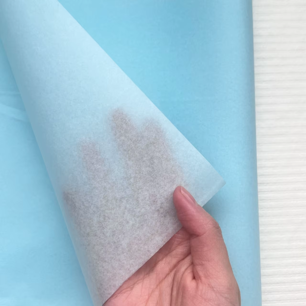 Layered pastel tissue can create a soft reveal while keeping the gift easy to access.
Make colored tissue paper work with the real packing process
A sample is not only for checking a shade. Test it around the actual product, closure method, and packing sequence. Does the tissue sit neatly in the box? Can staff create the intended fold without slowing the line? Does the selected sheet size create excessive trimming or awkward handling? These questions make a visual concept more repeatable.
I used to begin with color; now I first ask how the product will be packed and handled. A roll can fit one workflow, while pre-cut sheets may fit another. The better choice depends on the carton dimensions, the number of units per day, and the desired presentation—not on a universal preference for one format. Putian C&Q Paper Co., Ltd. identifies colored tissue paper among its packaging, decorative, and filling-paper applications, so a specification-based discussion can begin with the intended use case and sample review rather than an assumed outcome.
A practical sample-review checklist
Before finalizing pastel color tissue paper, review the following points with the actual packaging components. This protects the aesthetic brief from small inconsistencies that can become obvious at the packing table.
- Palette fit: Compare the tissue with the box, label, ribbon, and product under the lighting where customers will see it.
- Color consistency: Confirm the approved sample and the naming convention for each shade; do not assume similar color names are interchangeable.
- Sheet or roll format: Choose a format that fits the pack-out sequence and minimizes unnecessary handling.
- Fold and reveal: Trial the opening view from the recipient’s perspective, not only the flat sample.
- Material confirmation: Ask for the current specification or relevant documentation needed for the intended application before making material or sustainability claims.
- Repeatability: Let more than one person pack a trial unit, then simplify the method if the result varies too much.
Keep the trend useful, not generic
Pastel packaging feels current when it has a purpose. A pale palette can support a calm premium mood, a playful seasonal collection, or a clean modern gift experience, but it should reflect the brand rather than follow a color trend automatically. If the paper is mainly used for presentation rather than protection, this comparison is more relevant: prioritize palette fit, folding behavior, and visual consistency before adding extra layers or special effects.
The most effective colored tissue paper plan is usually simple: one clear palette, a pack-out method that staff can repeat, and a sample approved beside the real product. That combination makes a soft aesthetic feel designed instead of accidental.
Final thought
Pastel color tissue paper creates soft, trendy gift aesthetics because it can shape the first visual moment without overpowering the gift itself. Start with the intended packaging scene, select shades around a visual anchor, test the tissue in the real workflow, and approve samples before committing to a broader order. The result is not just a prettier sheet of paper; it is a more coherent unboxing experience.